

Challenges
The corporate website does not fully convey the appeal of ‘Nice Baby,’ and there is a lack of clear pathways for catalog requests
Therefore, we aim to create a landing page that introduces ‘Nice Baby’ to a broader audience and makes it easy for users to request catalogs
Target
- Pregnant women in their second and third trimesters
- Those approaching childbirth who are uncertain about what preparations to make.
Scope of Work
Creation of a landing page (LP) focused on emphasizing the benefits of obtaining the catalog
Customer Requests
- We want to communicate the benefits of obtaining the catalog.
- We want to communicate the benefits of rental services.
- We want to emphasize that Nice Baby maintains a large inventory, enabling many people to rent the high-quality items carefully selected by Nice Baby.
- Due to a significant volume of access from smartphones, we intend to adopt a mobile-first approach, prioritizing page design optimized for mobile users.
Our Innovations
- We positioned the ‘Service Details and Benefits’ prominently in the first view upon user access and installed a conversion (CV) button to drive user actions.
- Below the first view, the site is designed to guide users smoothly to conversion (CV) without causing stress or anxiety by incorporating voices of experienced mothers throughout the content, enabling users to empathize and engage as they progress.
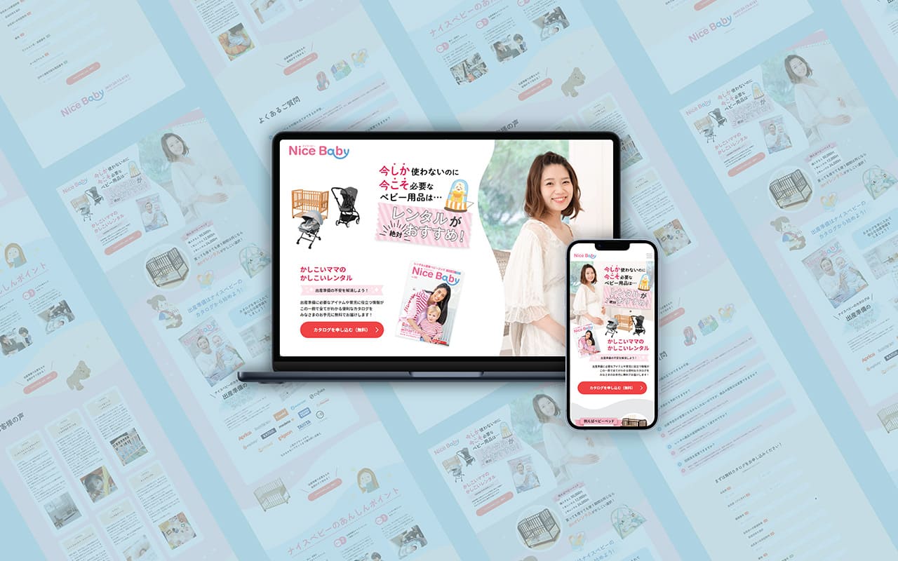
Definition of Target Personas
We have defined the persona profile as follows.
- Pregnant women from the second trimester onward
- First childbirth
- As this is my first childbirth, I am researching what preparations are necessary
- Residing throughout the entire Kanto region
- Considering giving birth in their hometown as well
- When researching online, I often find only fragmented information, so I believe having a compiled booklet or similar resource would be beneficial.
Based on this, we hypothesized that the target users are actively seeking information related to childbirth and prefer information presented in a clear, organized manner.
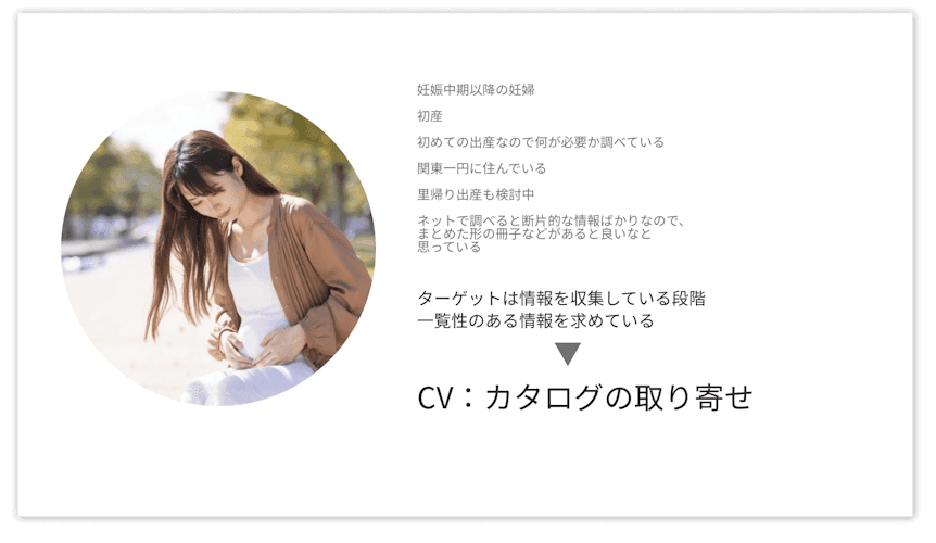
Storyline Development
We created a wireframe structured with the narrative flow of introduction, development, turn, and conclusion, targeting the defined persona.
- Introduction: Present the advantages of rental services.
- Development: Describe Nice Baby’s product lineup and its benefits
- Turn: Emphasize benefits beyond the product selection.
- Conclusion: Alleviate pre-conversion concerns by conveying actual user experiences.
In addition, integrating testimonials from seasoned mothers throughout the content helps to alleviate potential user concerns
- Relief from postpartum anxiety
- Regarding Hygiene
- Response to Equipment Failure
- Flexible Return Date Policy
We carefully positioned the above four points to foster a sense of reassurance and trust among users.
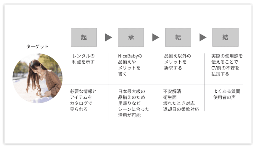
The Relationship Between Personas and the Catalog
By conducting interviews with experienced mothers, we categorized the relationship between catalog requests and persona profiles into the following four points and examined the key messages to be conveyed.
Items Under Consideration
- Catalog Requests (Reasons for Interest, Expectations, and Concerns)
- Preparation for Childbirth and Concerns (What Is Needed for Childcare?)
- What if there were a catalog? (All essential childcare information compiled into one volume)
Design Considerations for the First View
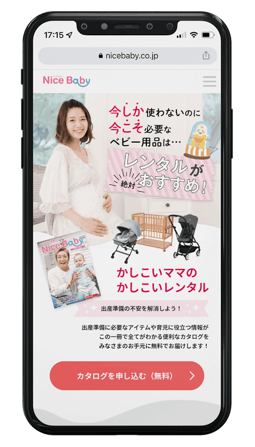
- Within the first view seen upon access, we emphasized the service details and benefits, and installed a conversion (CV) button to guide users toward taking action.
- When browsing a website, human eye movement typically follows an ‘F’ pattern; therefore, the layout is designed to align with users’ natural gaze.