EC site improvement consulting case study
We provided consulting and improvement measures for a B2B EC site that only sells its own products.
The client had the following concerns, which we helped resolve:
- I know that my company’s EC site is difficult to use, but I don’t know how or why it is difficult to use.
- I don’t know how to improve it
- At a certain point, organic traffic dropped drastically and I started to feel anxious.
- I can’t decide the direction of the site, such as how much potential it has or what it should be.
- There is no SEO knowledge in the company, so we don’t know how to attract customers through the web.
- Although the company is well-known as a manufacturer in the industry, it feels a sense of crisis about continuing to rely on traditional sales channels.
All of the products sold on the EC site are the company’s own products, with unit prices ranging from hundreds of thousands to millions of yen, and
most of the EC site’s customers are corporations.
Therefore, we have made specific improvements along the following lines:
Site status analysis
We analyze and understand trends such as traffic paths to the site, conversion paths, and seasonality using Google Analytics (including GA4) .
You can also use Google Search Console to understand what queries are bringing traffic to your site, how
your SERPs (search results) look, and trends in CTR.
Since all businesses are affected by the times, we listen to market and current conditions and
evaluate the trends in various data on the site.
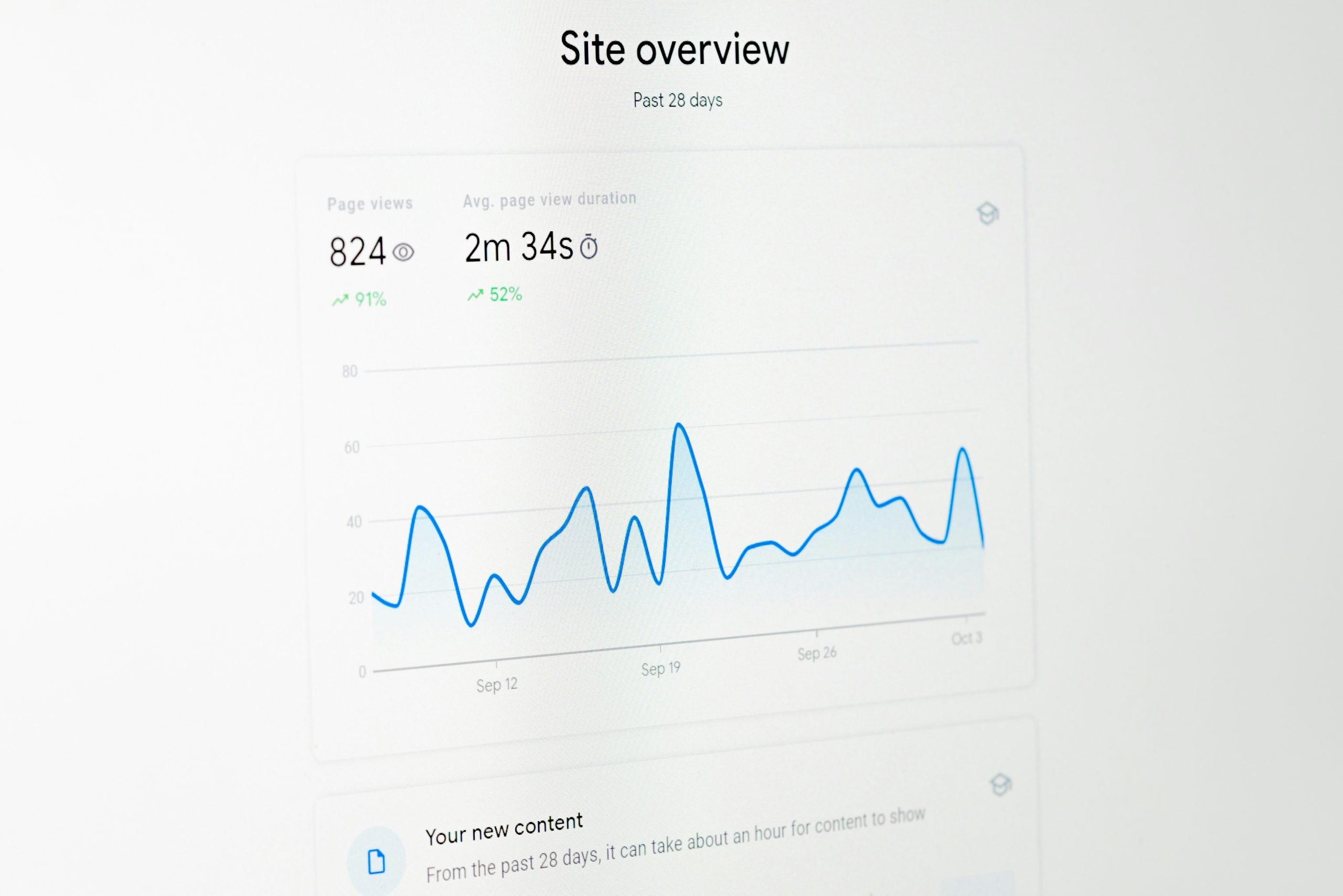
It was found that half of the traffic to the e-commerce site in question came from organic search, and the other half came from a subdomain of the corporate website.
Therefore, it has become clear that in addition to SEO to increase organic traffic, it is
also important to improve traffic to the corporate website itself and the flow of traffic from the corporate website .
Furthermore, we discovered that the direct reason for the sharp decline in organic traffic was that
the e-commerce site’s CMS had been moved several months prior to our analysis, and redirection measures had been omitted at that time, causing
all pages on the old CMS to become 404, which in turn
caused Google to re-evaluate all of their SEO rankings.
It was also discovered that although many of the site’s customers were Windows users, the site
was using a font called Hiragino, which is not included in the Windows default menu, thereby
unintentionally worsening the UI for Windows users .
Competitive analysis and determining the direction of the site
From an SEO perspective, it is important to focus on queries that are directly or indirectly related to sales,
or queries in which competitors rank highly, and take measures such as improving content .
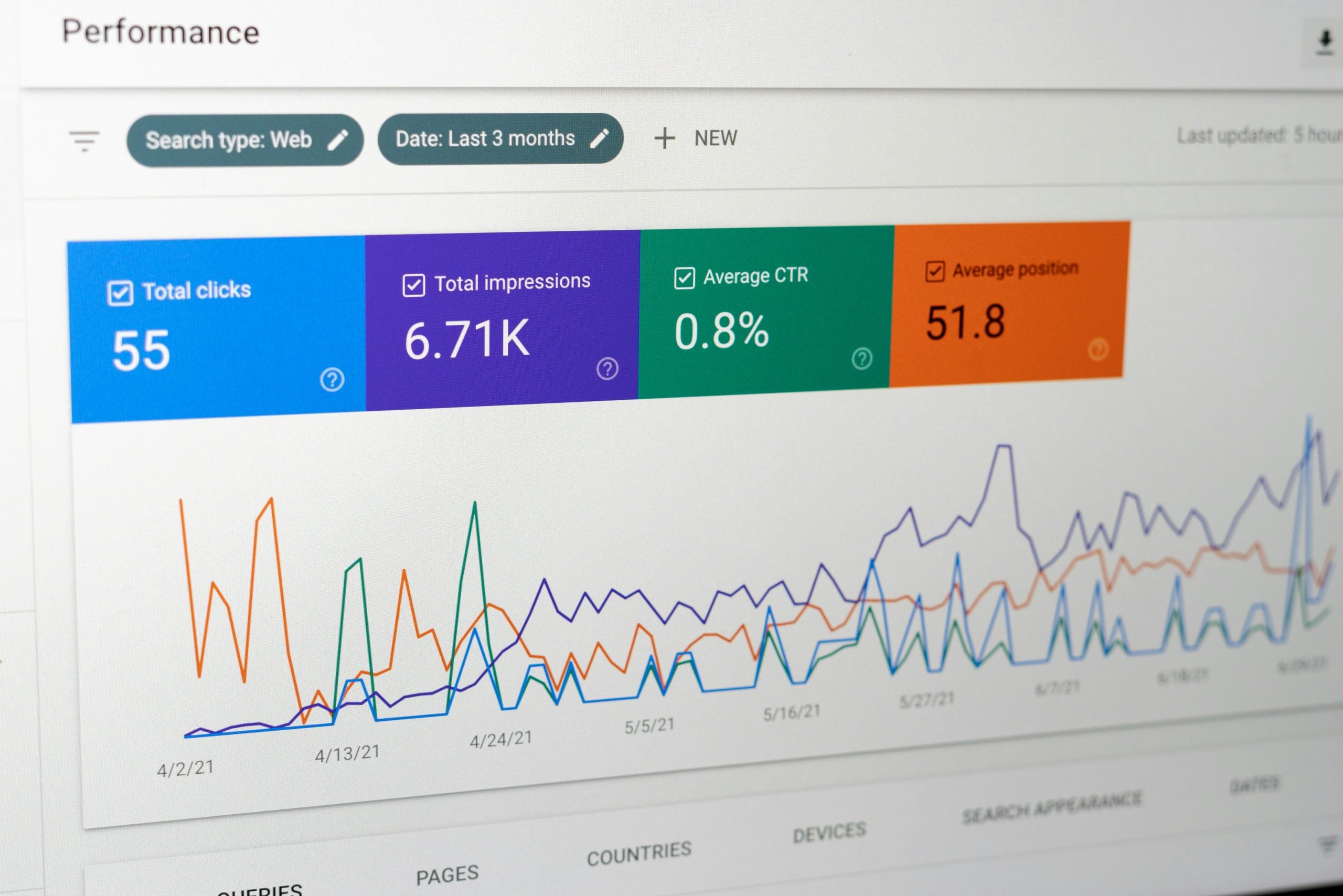
After analyzing Google Search Console, we conducted
a competitive analysis, limiting our focus to queries that are directly or indirectly related to the client’s business and that should rank highly.
However, the search volume for business-related queries is relatively low, at around 100-200, and we found that
even if we ranked first for that query, the number of visitors we could expect would be limited .
Therefore, rather than investing resources in improving and creating SEO content, we decided that the direction of the EC site should be to prioritize measures to
improve the usability and UI of the EC site and enhance the experience of customers who have a high probability of landing on the site .
*In B2B businesses, even if you try to create content to attract web customers from an SEO perspective,
there is often little search volume to begin with.
In such cases, even if you rank first or higher, the expected traffic may be low and
the cost-effectiveness may be low. Therefore, there are many cases where you should invest resources in advertising rather than SEO,
or focus on improving the user experience of your current site.
However, if the cost of an EC site is very high,
there are cases where resources should still be invested in SEO content improvement and measures.
In this client’s case, the policy was to lower the priority of content improvement and creation.
Detailed site analysis using heat maps and other tools to implement improvement measures
We implemented heat maps such as Microsoft Clarity
to analyze what actions users were taking after landing on the site.

If there are any dead clicks or user behavior that goes against expectations, we will implement specific improvement measures.
By introducing heat maps, the site in question
discovered that some of the banners in the main visual above the first page were being clicked less than expected.
Therefore, we carried out detailed planning, redesign,
and AB testing of the main visual banner as a measure to reduce opportunity loss.
When creating the banners, we
decided to prepare creative pieces with different appeals, just like with web advertising banners, and quantitatively measure which banners resonated most with users.
Furthermore, we found that the menu on the left sidebar was not being used as much as expected,
making the UI difficult for users to use.
Therefore, we have reorganized the menu on the left sidebar from a user’s perspective rather than a seller’s, creating a more user-friendly UI.
It is very difficult for many companies to evaluate their own website from the buyer’s user-first perspective .
Using our experience, track record, and knowledge, we can evaluate your website from a third-party and user perspective, identifying areas for improvement from a zero-base and implementing them into your strategy.
Content Improvement
Through access analysis, the e-commerce site in question found that customers who landed on the site with a high probability of success were interested in existing product selection content.
We then suggested improvements to the existing content pages, which helped increase the click-through rate of the CTA.
- The existing selection method content had the following issues:
- There is little text
- The advantages and disadvantages of each product category are unclear
- CTA links to the wrong place
- The CTA is unfriendly and difficult for customers to understand
- The page design has a dark and problematic impression.
- The content structure is unclear
The existing content was heavily sales-oriented and written from the seller’s perspective,
and the design was also difficult for e-commerce site customers to use and find useful.
As a result, although customers were landing on the site, they would quickly leave without taking any action,
making it difficult to convert into sales and resulting in a significant loss of opportunity.
Therefore, we improved and created content that paid attention to even the smallest details to address the issues mentioned above,
and we were able to increase our CVR.
In particular, improvements to CTA text, UI flow, design improvements, and changes to content structure from a customer perspective
were all made possible by our company’s proven perspective.
Results verification
We quantitatively verify what changes have occurred as a result of content or website improvements compared to before the improvements.
If it is SEO content improvement or production,
we verify the change in ranking using Search Console, GRC, or other ranking acquisition tools, and if it is website improvement, we re-analyze traffic using GA4, etc.
We also use heat maps and other tools introduced into the analysis to verify changes in user behavior and evaluate results.
Improvement results
After redesigning their main visual, the e-commerce site
saw a dramatic increase in the click-through rate of their main visual banner.
The banner and the page it links to promote the e-commerce site’s flagship model products.
By appealing to users who were likely to visit the site, even if they did not immediately make a purchase,
we helped to raise awareness of the flagship model.
Also, we were originally hovering around the second page (13th to 15th place) for the target query, but
six months after improving the site, we rose to number one for the query.